PROJECT OVERVIEW
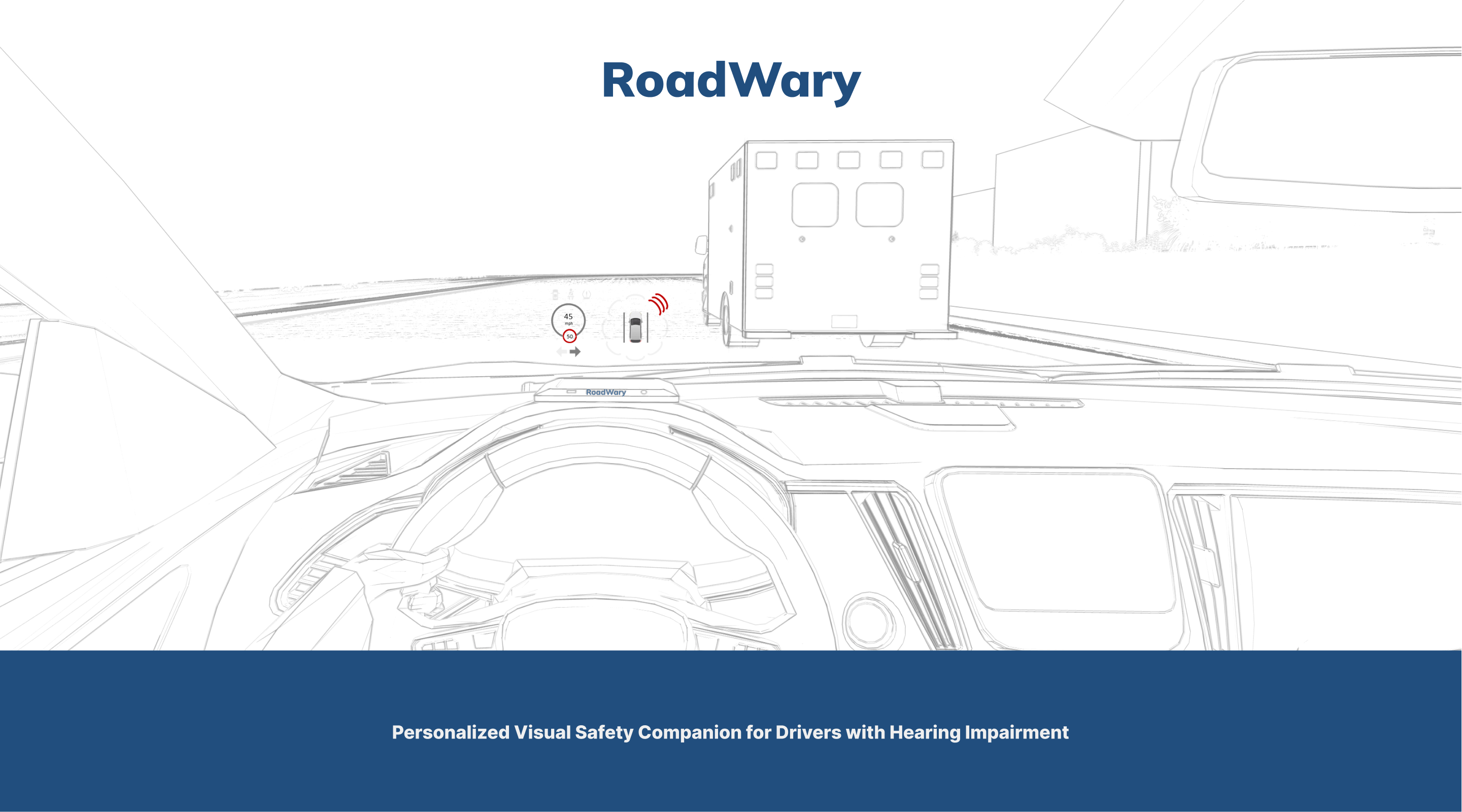
- The Personalized Visual Safety Companion is a project that aims to enhance road safety for drivers who are deaf or hard of hearing.
- The project leverages innovative technology to develop a heads-up display application that serves as a personal assistant to alert drivers about approaching emergency vehicles.
- The application and the product works by accurately identifying the distinct sounds of emergency vehicle sirens using real-time audio detection, and instantly translates these audio signals into clear, easy-to-understand visual alerts displayed on the driver's HUD or smart glass.
- This immediate alert system facilitates deaf and hard-of-hearing drivers to respond to emergency vehicles promptly, ensuring their safety and the safety of others on the road.
Role
UX researcher | Product Designer
3D Designer | Accessibility Designer
Tools
Figma | Miro | Adobe Photoshop
Rhino | Lumion | Sketchup
Topics
Accessibility | Product Design | Physical Interface | Speculative Design
Timeline
6 Weeks
MEET THE DESIGN TEAM

UNDERSTANDING THE USER
SECONDARY RESEARCH
According to WHO(2021), hearing loss and deafness are serious problems all over the world.


Many people with hearing loss use sign language as their primary mode of communication. However, not all people who are hard of hearing use sign language. Other communication methods include lip reading, written communication, and hearing aids or cochlear implants.
Types of Hearing Losses
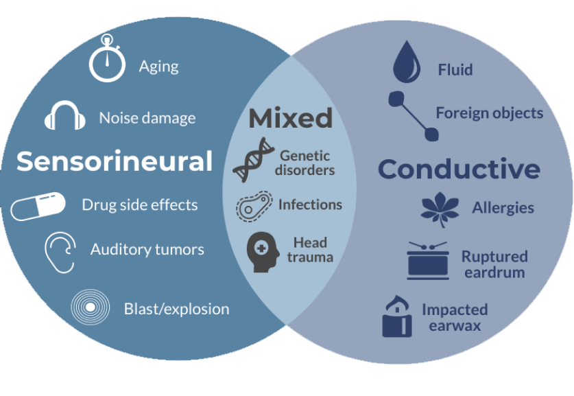
- Sensorineural hearing loss (SNHL) is the most common type of hearing loss and involves problems with the inner ear (cochlea) or auditory nerve. Sensorineural hearing loss is typically due to damage to the hair cells in the cochlea or the nerve pathways that carry the sound from the inner ear to the brain. This can occur due to Aging, Noise damage, Drug side effects and auditory tumors.
- Conductive hearing loss (CHL) occurs when there is a problem transmitting sound waves through the outer ear, tympanic membrane (eardrum), or middle ear (ossicles). Essentially, it's a mechanical problem of the ear that prevents sound from being conducted efficiently to the inner ear. This can occur due to Fluids, foreign objects, allergies and ruptured eardrums.
Difficulties affecting the Hearing impaired
My team and I chose to concentrate on the daily challenges encountered by the deaf community. We explored the extent of these issues and the existing innovative solutions designed to support them in accomplishing a range of tasks. There are multiple obstacles like,
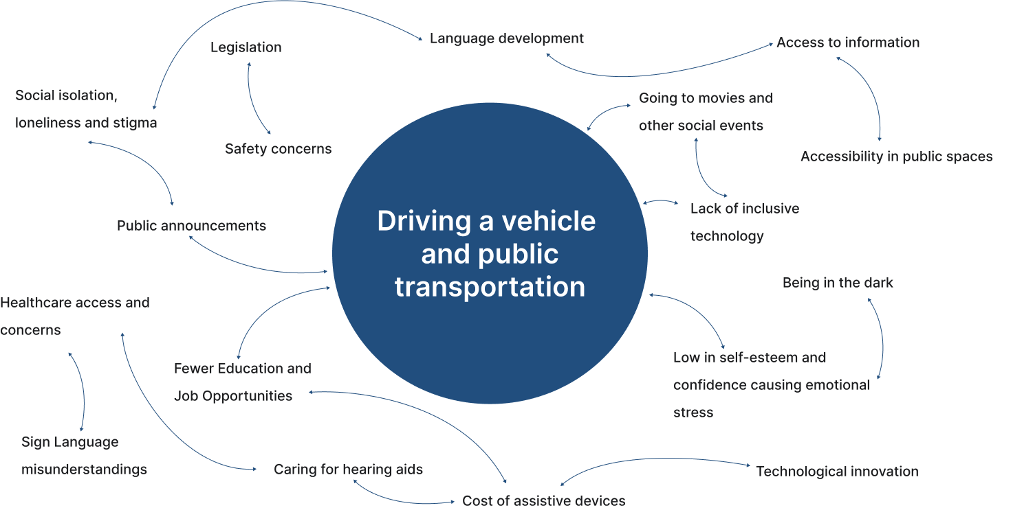
Why focus on driving and vehicle and transportation?
- Safety: This is a primary concern. It is crucial to ensure that individuals with hearing impairments can safely navigate the roads, whether they're driving or using public transportation. They need to be able to identify emergency vehicle sirens, horns from other vehicles, and announcements on public transport.
- Independence and Mobility: Being able to drive or use public transportation independently is a key aspect of personal freedom and mobility. It allows individuals to travel to work, attend social events, run errands, and generally participate in society without requiring assistance.
- Equal Access: Everyone should have equal access to transportation, a fundamental public resource. Addressing the challenges faced by hearing-impaired individuals in this area promotes inclusivity and equality.
- Employment Opportunities: Accessibility to reliable transportation directly impacts the ability to secure and maintain employment. Enhancing this accessibility could lead to a broader range of job opportunities for the hearing-impaired community.
- Quality of Life: Facilitating easier and more efficient transportation can significantly improve the overall quality of life for individuals with hearing loss, reducing potential stress and social isolation.

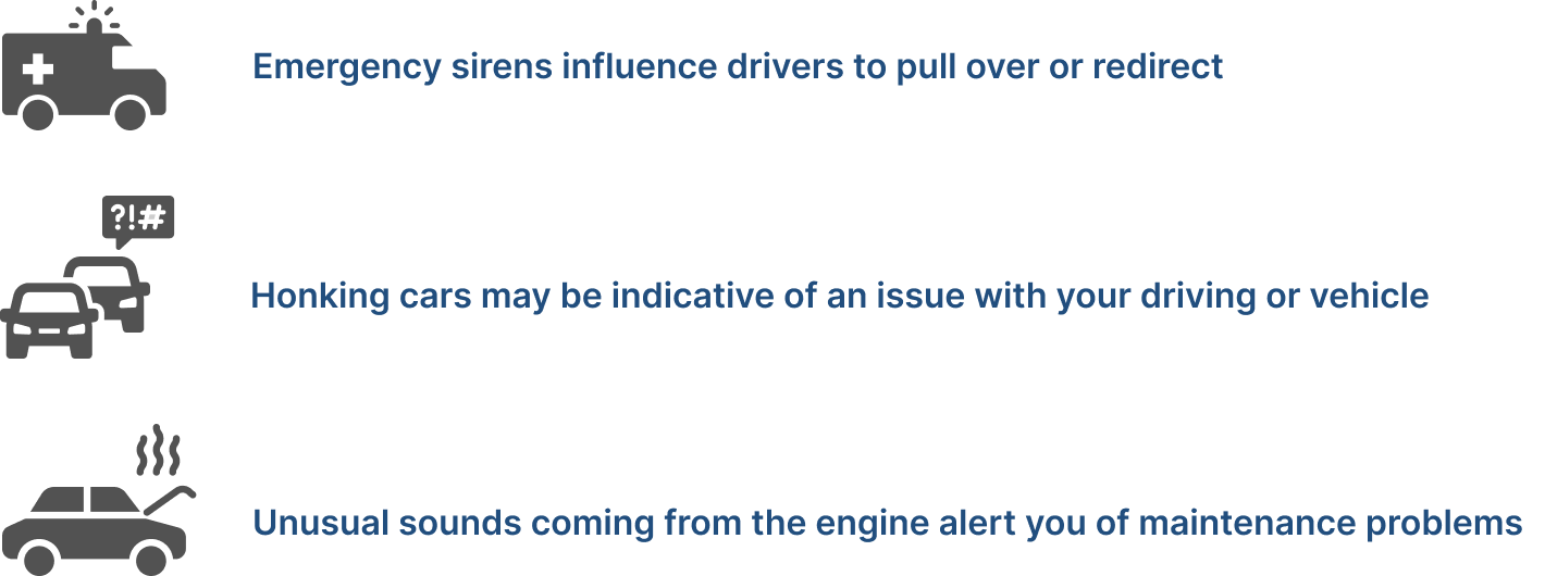
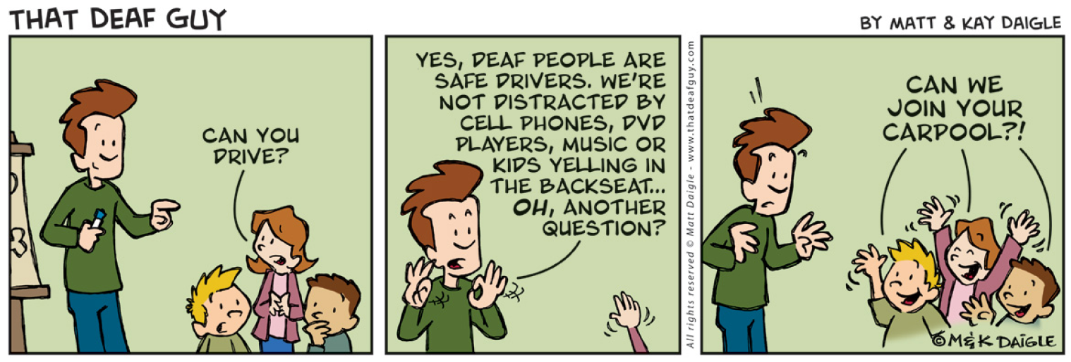
How does hearing loss directly affect driving?
While sight is the most crucial sense for driving, a lot of important information comes from sound.


PRIMARY RESEARCH
Surveys
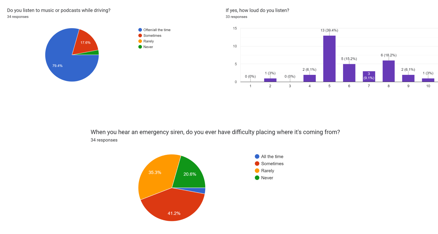
We believe that the best way to create a product that truly meets user’s needs is by understanding those users as thoroughly as possible. In the case of designing an application or a product to aid hard-of-hearing and deaf individuals while driving, conducting a user survey is of utmost importance. By conducting user surveys, we were able to gather valuable first-hand information from a large number of individuals within the community. This data was then use to inform the design process, ensuring that the end product effectively solves the real problems these individuals face on the road.
We received about 34 responses from different individuals, but only three reported to have any auditory processing disorder, although, it is important to acknowledge that this data was predominantly from our younger demographics.

We discovered that it's not just individuals who are hard of hearing or deaf who can be oblivious to external sounds while driving. In fact, many people tend to play loud music in their vehicles or drive cars with soundproof cabins, creating a similar challenge. This realization inspired us to innovate a solution that could be universally applicable and beneficial to all drivers, regardless of their hearing capabilities.
Survey Statistics
MARKET RESEARCH
CURRENT TECHNOLOGIES FOR HEARING IMPAIRED WHILE DRIVING
Vehicle alert systems:
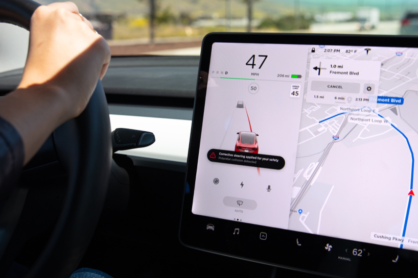
Some car manufacturers have started to incorporate alert systems that can detect emergency vehicle sirens and other important road sounds, and provide visual or tactile notifications to the driver. While not specifically designed for the deaf and hard-of-hearing community, these systems may not be useful to these individuals.
Hearing assistive technology:
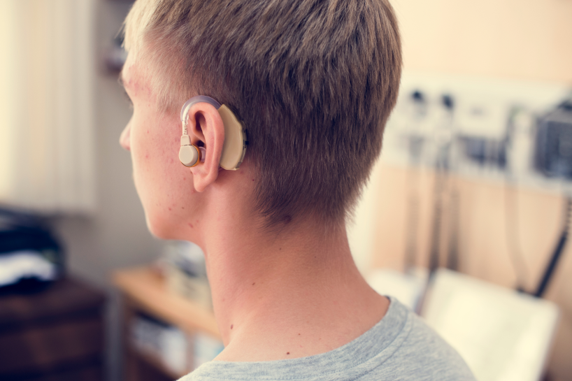
Products like hearing aids or cochlear implants often have features designed to enhance the user's ability to detect certain sounds, like sirens. However, they do not translate these sounds into visual signals, and may not be effective for all users.
Mobile apps:
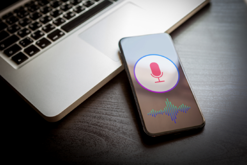
There are various mobile apps designed to assist people with hearing impairments, some of which translate sounds into visual or vibratory alerts. However, none of these were specifically designed for use while driving.
USER PERSONA
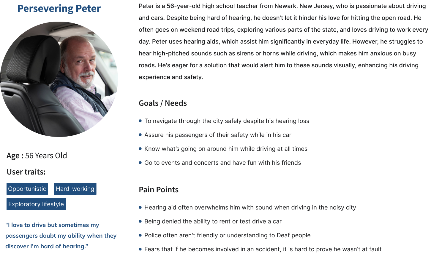
By creating a persona we were able to focus on the integral part of the user-centered design process. The persona serve as a consistent reference, representing the needs and characteristics of the targeted user base. It helped us in focusing design decisions, fostering empathy, facilitating communication within the team, and prioritizing product features. Furthermore, it also allowed us for a better understanding of the users, ensuring that the design caters to a wide range of needs.
PROBLEM STATEMENT
Deaf and Hard of hearing are the target users because they face unique challenges while driving due to their inability to hear auditory cues such as sirens from emergency vehicles. This can lead to dangerous situations on the road, as failing to yield to emergency vehicles can cause accidents and delay critical emergency services.
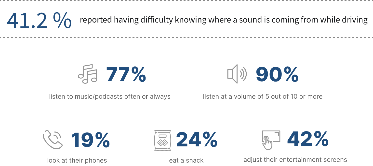
According to the CDC, nearly 16% of US adults report some form of hearing loss. Even more drivers tend to listen to music and podcasts at high volumes which impacts their ability to hear the road outside.
This leaves a high proportion of drivers, even with normal hearing, missing out on essential information which is currently conveyed only through sound. Those with hearing impairments have even further difficulty.
Driving requires continuous awareness of one's surroundings, and auditory signals play a significant role in this. For those who are deaf or hard-of-hearing, this crucial information is absent, which makes it harder for them to respond appropriately and promptly. Hence, there is a need for a solution that can compensate for this lack of auditory information and provide visual alerts instead.
Our survey results revealed that locating emergency sirens was a significant concern for most participants, the majority of whom were not deaf. This finding underscored the potential for any solution we develop for deaf drivers to have broader applicability. Consequently, we opted to revise our "How Might We" statement to adopt a more universal approach.

BRAINSTORMING SOLUTIONS
LEVERAGING CURRENT TECHNOLOGICAL ASPECTS AND DESIGN IDEAS
Sketching out the product concepts was an essential part of our process. This initial sketching phase allowed us to put our ideas onto paper and visualize how the product might function and look. We had to ensure that we had a clear understanding of the problem we are trying to solve and the users we are designing for. This understanding guided our sketching process and ensured that we are not just designing something that looks good, but something that will also meet the users' needs effectively.
We also considered how the product interface would integrate with existing in-car systems, and sketched potential configurations. This could include how it would look on different dashboard styles or how it would interact with other systems like GPS navigation or music controls, adding details such as button design, iconography, and typography. I focused my attention to the visual alert system, sketching various iterations to represent different kinds of alerts like sirens or horns along with my team member Elon.
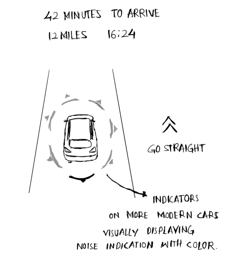
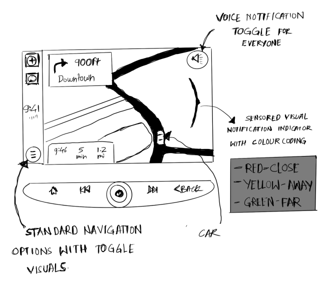
Following our initial explorations, we collaborated as a team to develop the final version, which would effectively merge functional, aesthetic, and readable elements from the various concepts. While some of the ideas and features echoed typical interfaces seen in GPS navigation systems, others demanded a more tangible and engaging approach.
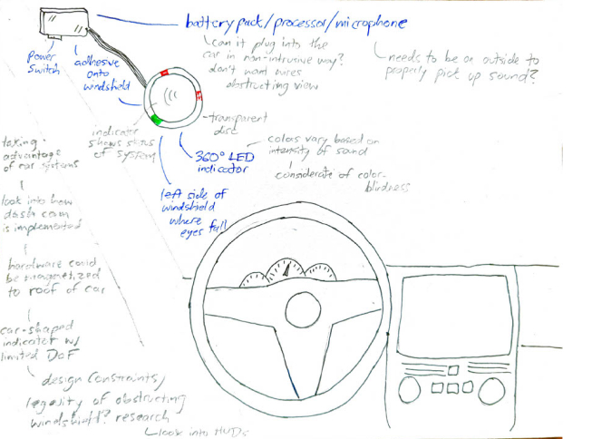
What is the Idea?
The idea is a revolutionary app and a product designed to empower deaf drivers by ensuring their safety on the road. This innovative heads-up display interface utilizes cutting-edge technology to identify and alert drivers about the presence of emergency vehicles in their vicinity. By integrating real-time audio detection and visual alert systems, the sensor seamlessly converts the sound of sirens into easily recognizable visual signals on the vehicle's windshield or HUD itself.
What is an HUD and how it can be used?
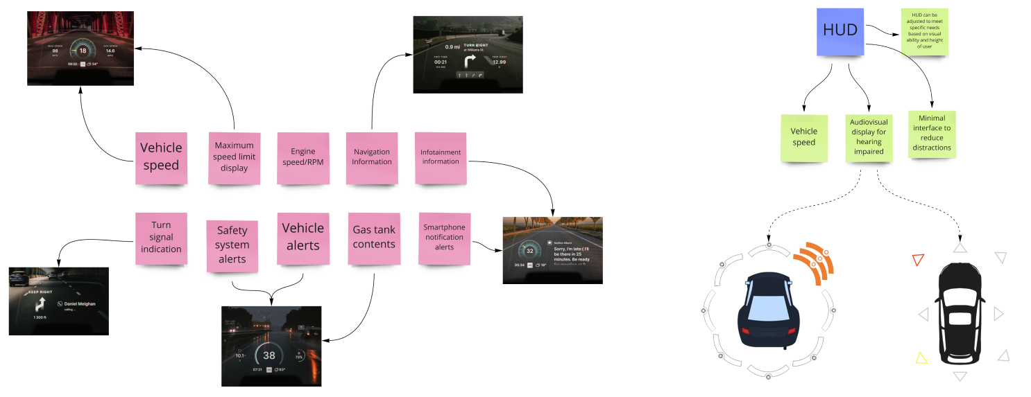
An HUD, or Head-Up Display, is a transparent display that presents data without requiring users to look away from their usual viewpoints, an HUD projects important information onto the windshield of the vehicle, placing it directly in the driver's line of sight. The goal is to enable drivers to access this information without having to take their eyes off the road, thereby increasing safety. HUDs can provide visual alerts for important auditory signals they might otherwise miss. For instance, a visual alert could be displayed on the HUD when an emergency vehicle is approaching, allowing the driver to respond appropriately.
While investigating various HUDs in the current market, we acknowledged their importance in conveying essential information. However, it also became evident that there's a saturation point beyond which the amount of information can become overwhelming. Our project's aim is to enhance drivers' awareness of surrounding sounds rather than inundate their visual field with an excess of data.
Logo and branding
One of our most exciting challenges was creating a logo that's both visually engaging and communicates the essence of the product or brand. Sketching was a crucial first step in this process, allowing my team to explore different ideas and concepts.
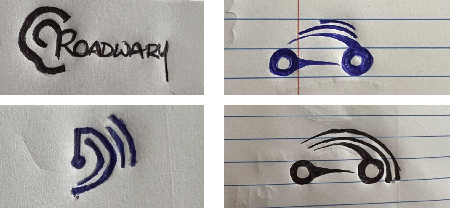
We had to fully understand the product and the message we wanted the logo to convey. For our heads-up display product and interface for drivers, the logo must evoke themes of safety, accessibility, driving, and technology. We explored a range of styles - from abstract shapes and symbols that might symbolize sound or alertness, to more literal representations such as stylized car or sound wave icons. After we had a range of sketches, we selected the most promising ones and refine them. We clarified the shapes, adjusted proportions, finalized the typography, and considered potential color combinations.
Color was another important aspect to consider. The color had to align with the overall visual language of the app and the product and reinforce the logo's message. For this project, we considered colors that are associated with alertness and safety, such as reds or yellows, and blues to indicate technology.
HIGH FIDELITY MOCKUPS
RoadWary sensor - Functionality
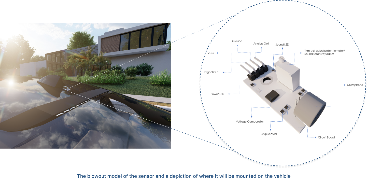
For our product to function effectively, we recognized the necessity for a sensor capable of transmitting real-time data to the in-car HUD. Positioned atop the vehicle as depicted in the above image, this sensor will capture ambient noise, process it, and relay the pertinent information to the HUD display within the vehicle. We created a 3D model for better understanding of the product and to easily explain its usage.
RoadWary HUD
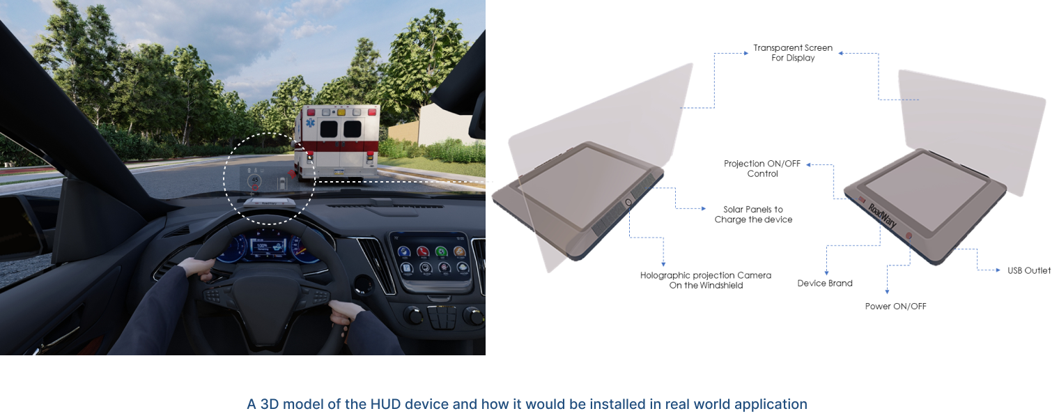
The heads-up display, which sits on the dashboard and projects crucial information onto the windshield, is another significant component of this product. The HUD displays relaying real-time auditory alerts visually, particularly benefiting drivers with hearing impairment by ensuring they are aware of crucial sounds in their environment, such as emergency vehicle sirens.
PLAY VIDEO
USER INTERFACE
VALIDATION AND USABILITY TESTING
We had to understand the user's needs and how they will interact with the application. This involves referring back to our user personas, their needs, and our user survey results. Our goal was to design a UI that is intuitive, user-friendly, and meets the specific needs of our target users - in this case, drivers who may have hearing impairments.
The first step was to create the UI design, to map out the user flow, define how users will navigate through the app to complete their tasks. This might include interactions like receiving visual alerts, adjusting settings, or viewing past alert history.
Once the user flow was defined, we started sketching out wireframes for each screen. This includes placement of elements like buttons, icons, text, and images, and also the layout of visual alerts on the HUD. At this stage, we were aiming to create a clear, uncluttered design that makes the most important information and interactions easily accessible.
Following the wireframing, we moved onto the visual design. This included selecting colors, fonts, and graphic styles that align with the overall brand identity. For our app, we want a design that feels modern and technological, but also communicates safety and reliability.
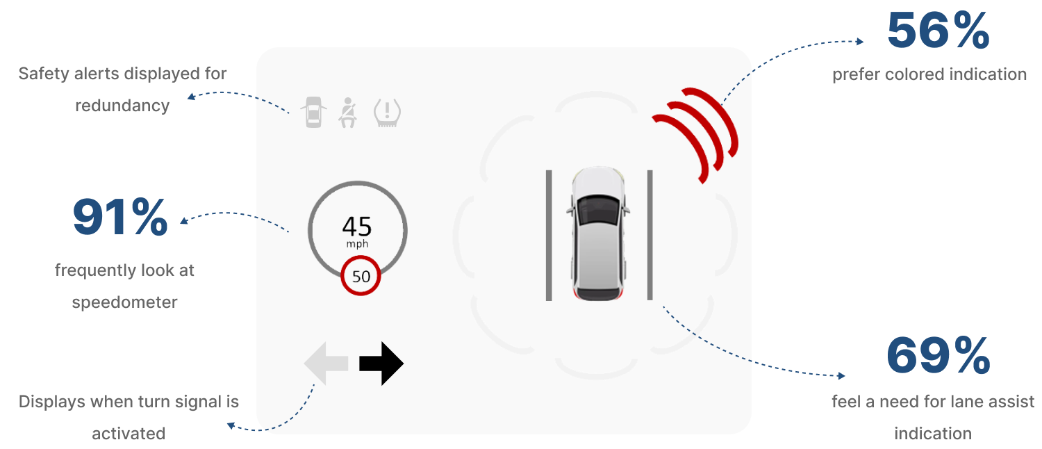
During the design process, we paid particular attention to the design of the visual alerts. They needed to be immediately noticeable, but not so intrusive that they distract the driver.
We also conducted usability testing surveys and product interaction with regular car drivers to get to know what works the best for them and how our interface can be improved, we got the following results,
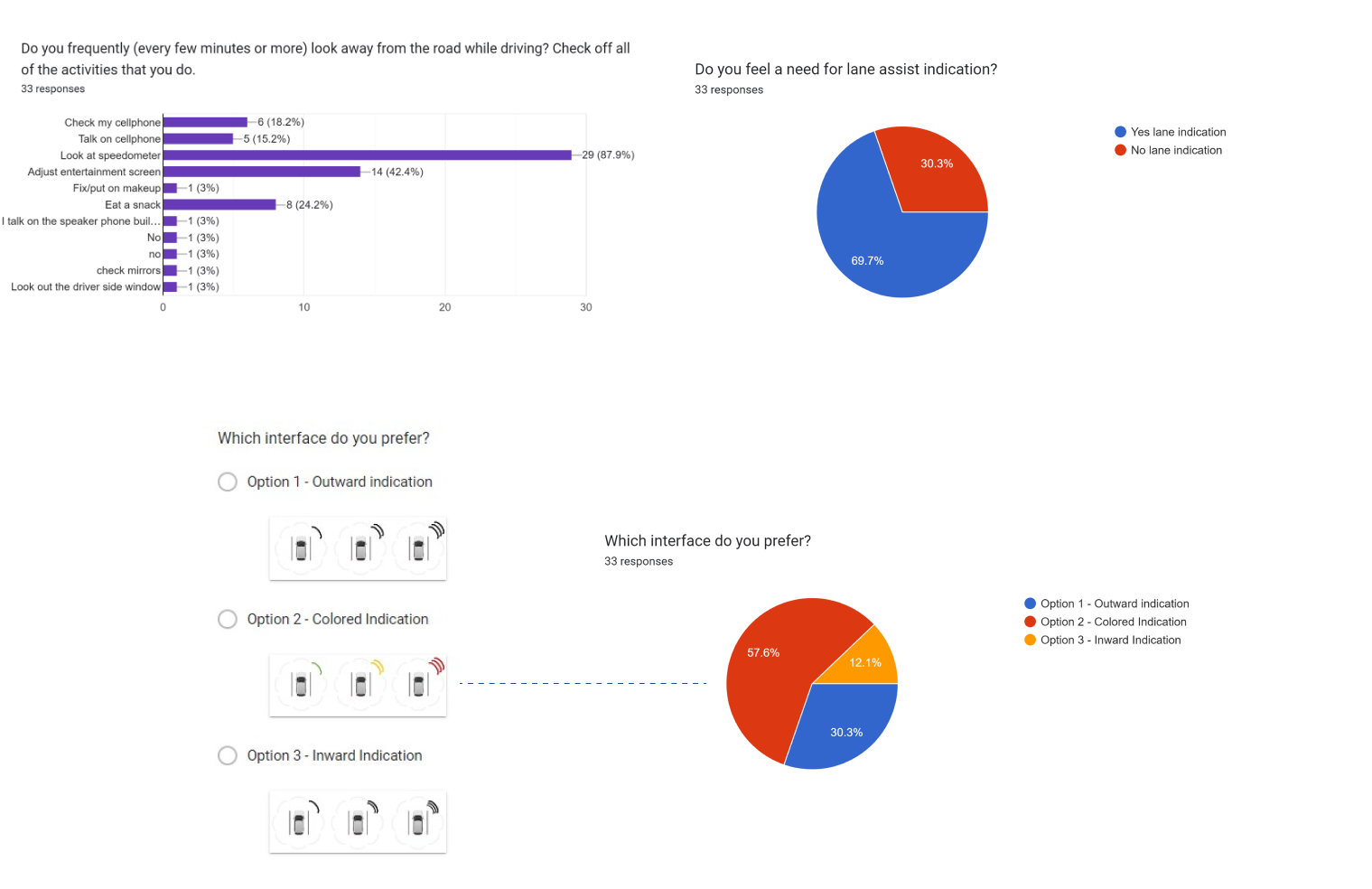
Considering the survey and the usability testing finding we experimented with different designs, colors, and animations to find the best solution.

PRODUCT VALIDATION
PRETOTYPING
Pretotyping is a strategy used in the early stages of product development to validate the appeal and functionality of a new concept. The term, coined by Alberto Savoia, is a combination of the words "pretend" and "prototyping."
Pretotyping is not about creating a functional version of the product (that's prototyping), but instead, it's about creating a pretend, or a very simple, version of the product concept to test the initial reaction and behavior of users and to verify if the product's core premise is sound and desirable.
Before investing time and resources in building an elaborate interactive prototype of a new mobile app, we created a series of finished sketches or a paper prototype and conducted user tests to see how potential users interact with the key features and what works the best for them.
The main advantage of this was, that it allowed us to quickly and inexpensively validate our concepts and concerns, and to fail fast and learn quickly. This way, we were able to avoid spending a lot of time and resources on developing concepts that might not resonate with users, and instead focus on those that show the most promise.
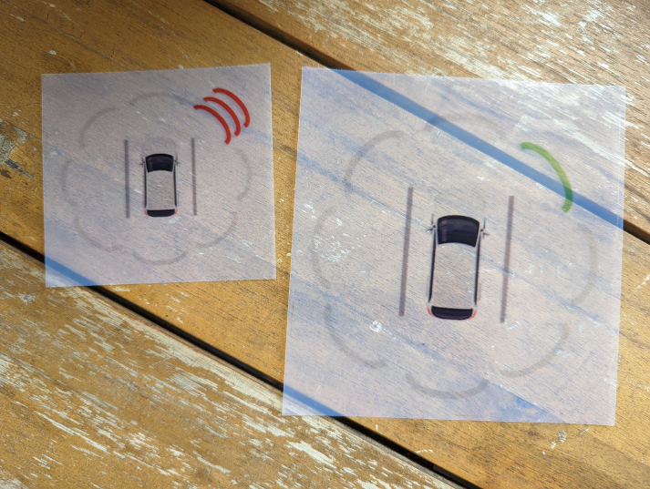
We asked users to try out our paper prototypes to validate our concerns and interface design at the earliest stages so we can assure the required design changes and assess to them.
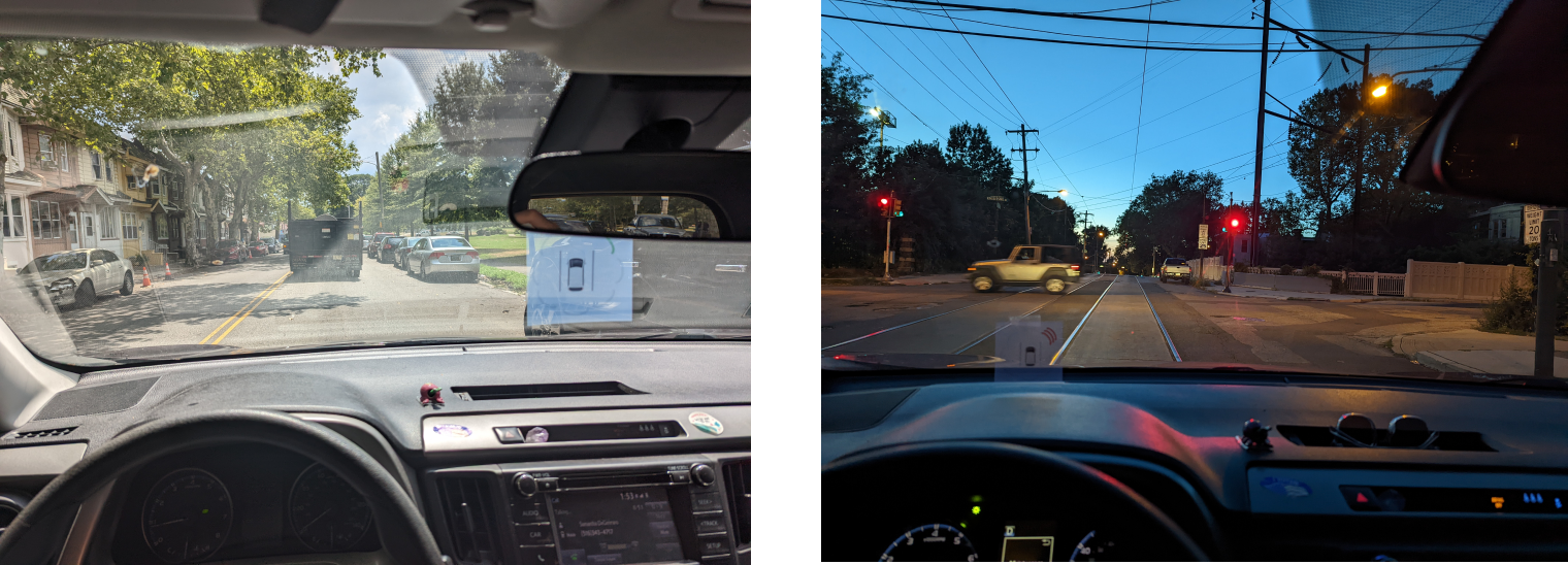
Validating reflection and time of the day
Validating Size
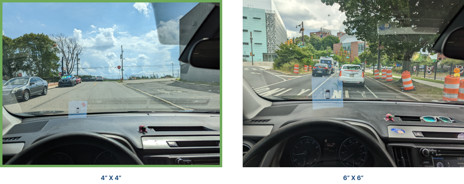
Validating Placement
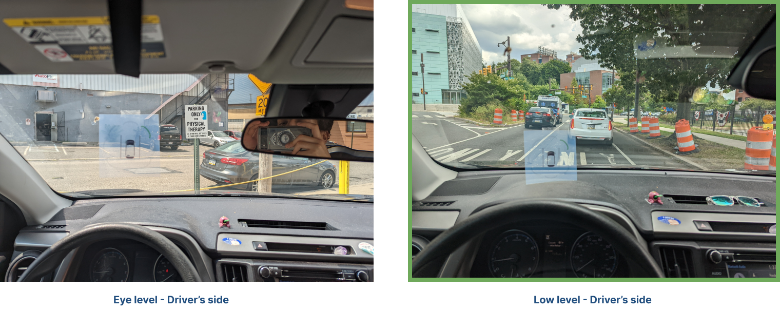
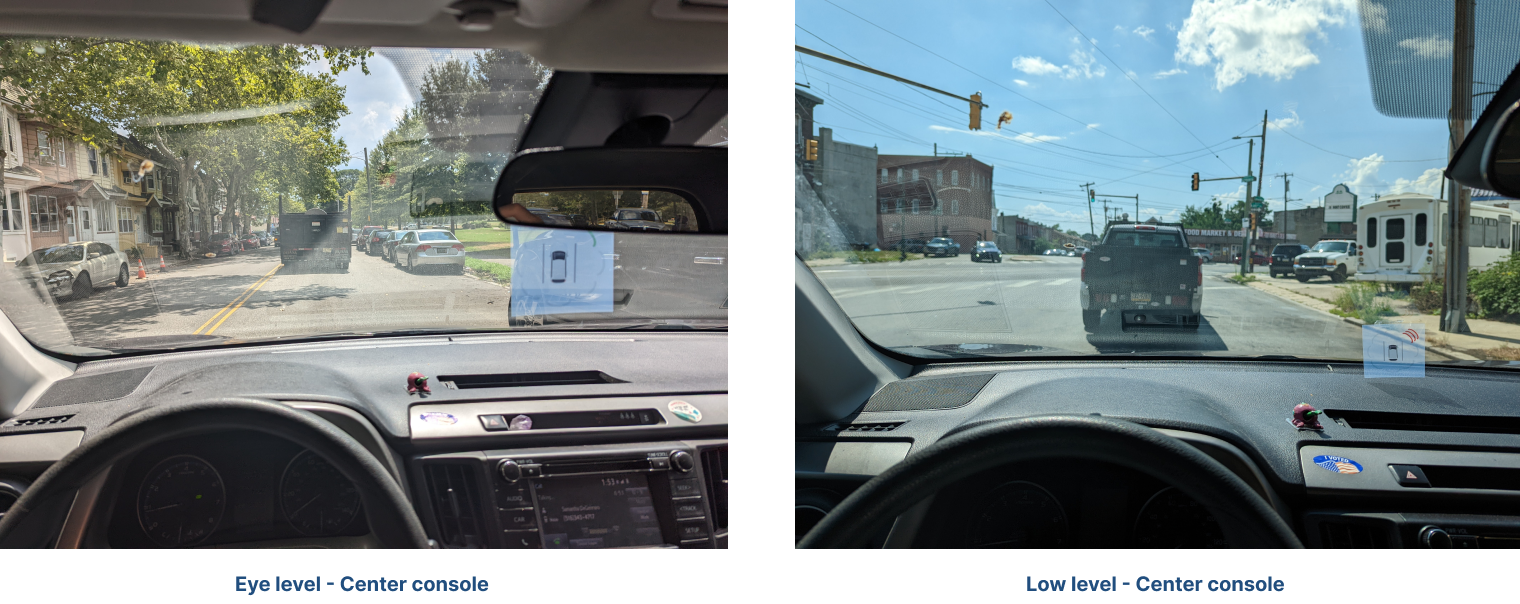
We experimented with each position and the size of the paper interface along with its placement, after feedback from the users we were able to derive what works the best for them.
CONCLUSION
In conclusion, this case study illustrates the significance of human-centered design and empathetic understanding in creating products that address unique needs. We embarked on a journey to create a Heads-Up Display (HUD) app that could transform the driving experience for the deaf and hard of hearing community. This led us to a broader realization that our solution had potential for universal application, extending beyond the initial target group to cater to all drivers who may need assistance with identifying emergency sounds for safer navigation.
Our comprehensive approach, encompassing extensive research, persona creation, surveys, iterative design, and user testing, was instrumental in the development of the final product. We closely studied the needs and challenges of the deaf and hard of hearing community, allowing us to devise an intuitive and responsive UI that prioritized user experience and safety.
The HUD and sensor integration, forming the heart of our product, demonstrated the value of innovative technology in creating accessible solutions. These components, coupled with the striking and effective UI design, contributed to the creation of a potentially transformative product for enhancing driving safety.
Our journey underscores the importance of empathy, user-centric design, and iterative development in creating meaningful and effective solutions. As we continue to evolve our product and adapt to user feedback and technological advancements, we are driven by our commitment to improving safety and independence for all drivers, regardless of their hearing abilities.
Research
Innovation & Design
Let's Work Together
"Ready to transform your vision into captivating designs? Let's collaborate! With my design skills and our ideas, we can create something unique and impactful. Contact me and let's get started!"
Address
East Falls, Philadelphia, PA - 19144
Phone
(+1) 267-231-0774
vaibhavg0402@gmail.com

Vaibhav Gaikwad UX Portfolio
Ux | Ui Portfolio