PROJECT OVERVIEW
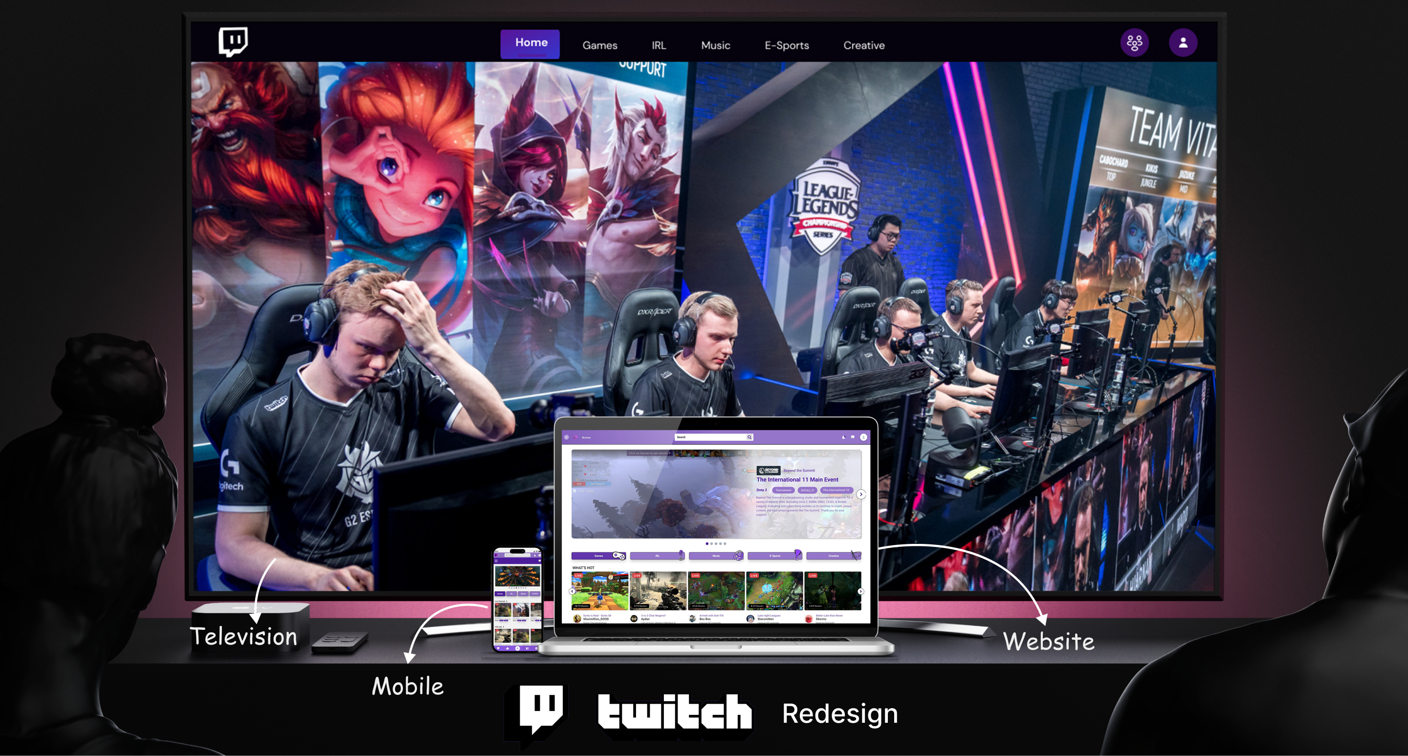
- The project was a part of the Advanced web design course, where I had to redesign interface for a video streaming platform on TV, Desktop and mobile.
- I decided to select twitch as my focus for redesign its interface, the reason for that was, twitch has kept their interface pretty standard for some time now, and as user needs and expectations evolve overtime, a redesign can help and meet those demands.
- Another reason was to improve the overall user experience and interaction of Twitch by redesigning its interface, enhancing its functionality, and boosting its performance.
- The primary focus was to make the platform more engaging and responsive for the categorized set of users and also the streamers.
Role
UX researcher | Product Designer
UX strategist | UI designer | Application Designer
Tools
Figma | Figjam | Miro | Adobe Photoshop | Adobe Illustrator | Protoyping
Topics
Digital Design | Product Design | Information Architecture | Research | Application Integration
Timeline
16 Weeks
PRODUCT OVERVIEW
Current Interface
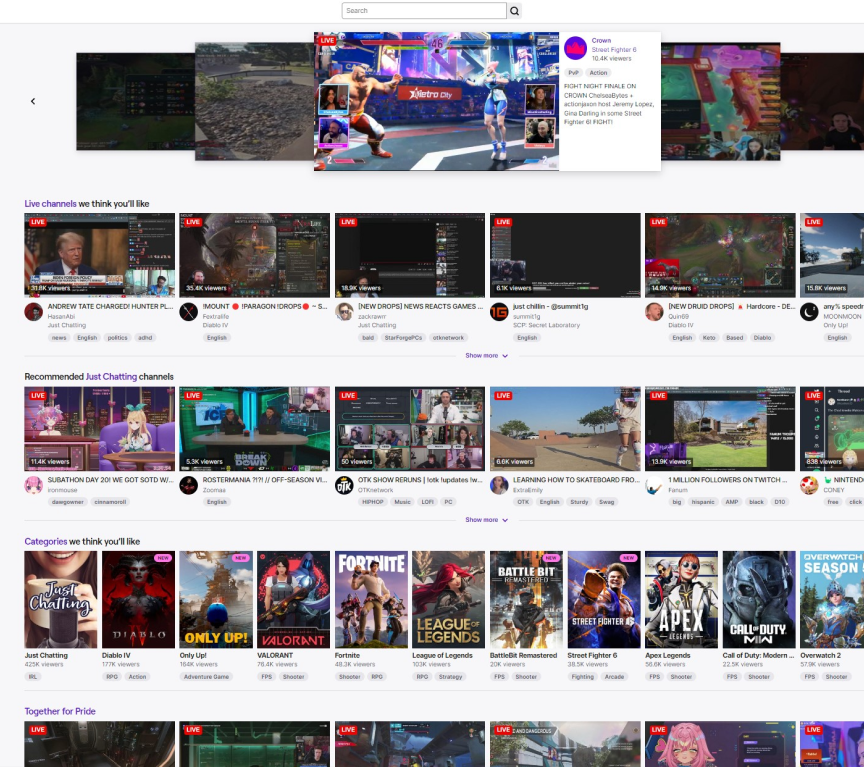
Use Slider on the Image
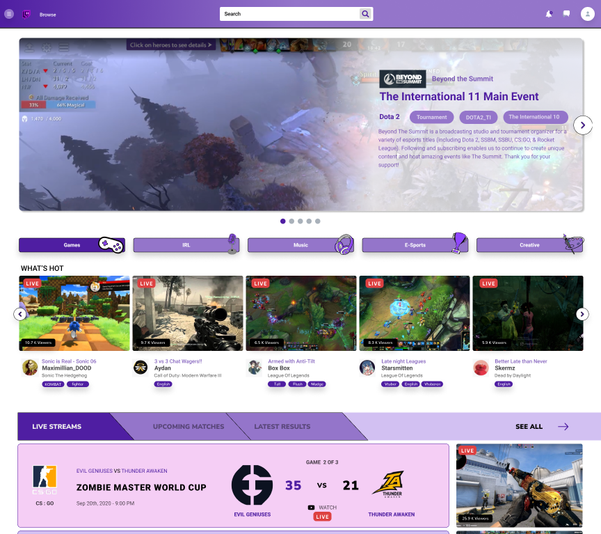
Redesigned interface
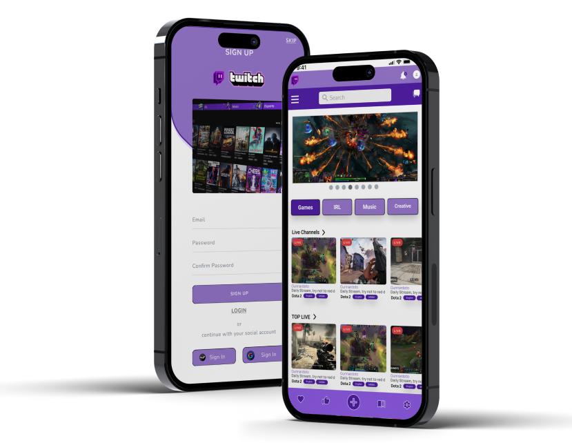
This project aimed to enhance the user interface of Twitch, a leading live streaming platform, across mobile, desktop, and TV devices. Initiating with a thorough research phase involving SWOT analysis, user personas, and Jobs to be Done, the design phase subsequently took shape with concept sketches and feature prioritization using the MoSCoW method.A clear site flow, skeleton wireframes, a vibrant mood board consistent with Twitch's branding, and high-fidelity prototypes for each platform were developed, culminating in a modern, intuitive, and engaging user experience. The project concluded with usability testing to gather user feedback and refine the final designs. In summary, the Twitch Interface Redesign project was an in-depth exercise in user-centric design and cross-platform UI development.
SECONDARY RESEARCH
To start analyzing twitch as a platform I started conducting my secondary research by finding user reviews and statistic reports for the video streaming platform, some of the key insights I got to know were,
Twitch as a streaming platform is mostly male dominated community targeting age group of 18-35 years old.
The platform is mainly recognized for its gaming community and streams, but it also has other categories like art, music, fitness and health, food and travel.
Esports play an important goal for the platform to attract its primary viewing database, as majority of the esports tournaments are broadcasted live on the platform, whereas Twitch is also the leading brand for esports broadcasting services.
Other categories like music and arts are showing positive amount of viewing climb rate since the past couple of years.
I had to consider these factors and insights while redesigning the platforms interface, making sure the user’s expectation and needs are the primary focus. To delve deeper and gain more key insights I also interviewed regular users of the platform to gain additional data.

MARKET RESEARCH
SWOT Analysis
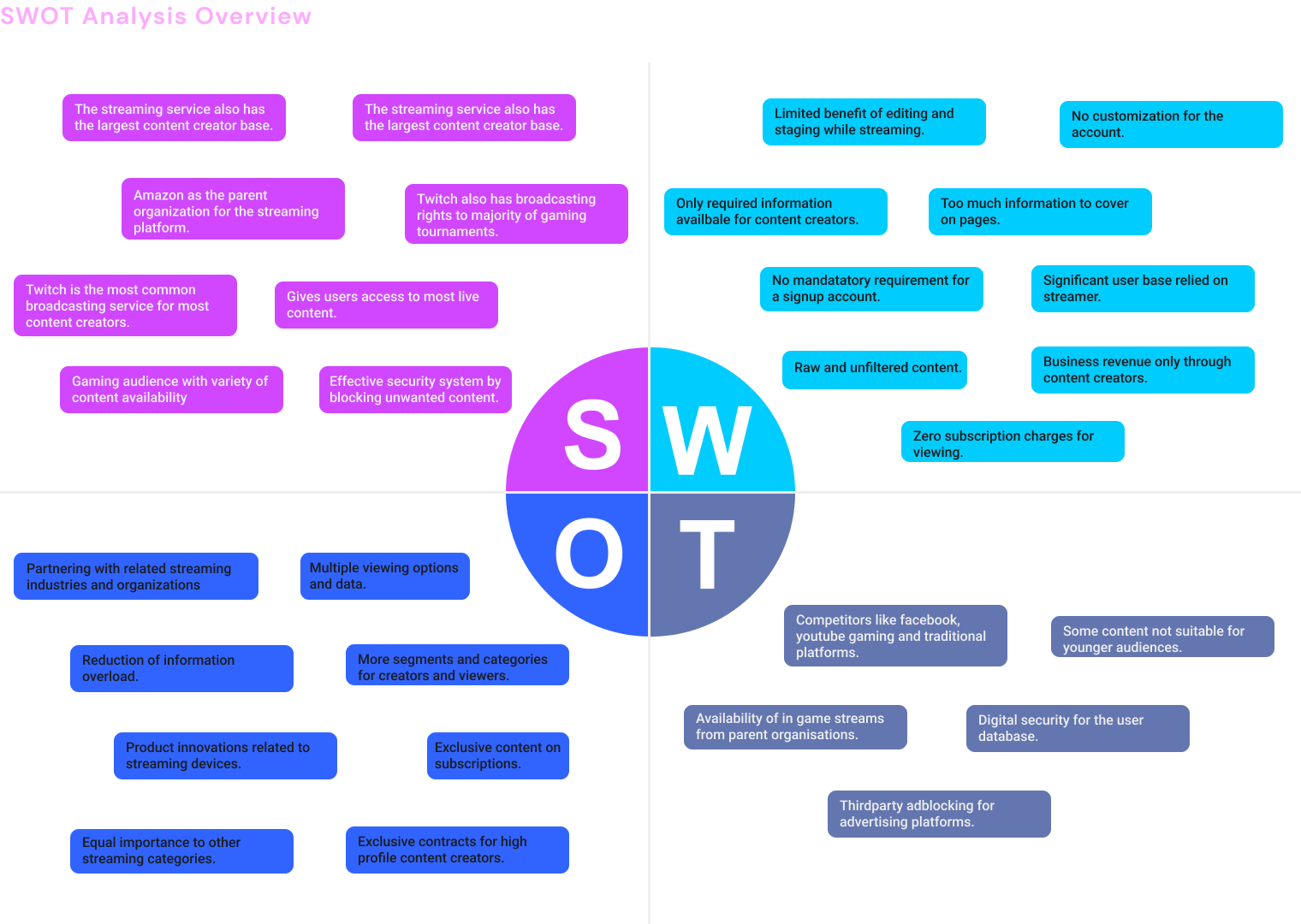
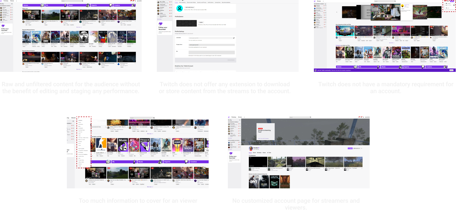
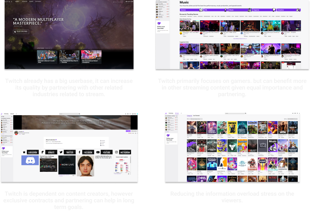
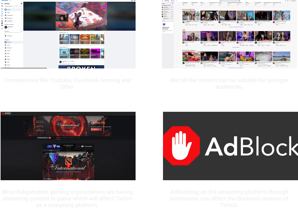
I used my secondary research insights and my user interviews to conduct a SWOT analysis to determine the company's internal strengths and weaknesses as well as the exterior opportunities and threats. This gave me a clear and thorough understanding of Twitch's present market position and potentials moving forward. It also aided in my comprehension of the live streaming platform's dynamics and served as a strategic decision-making tool for the project.
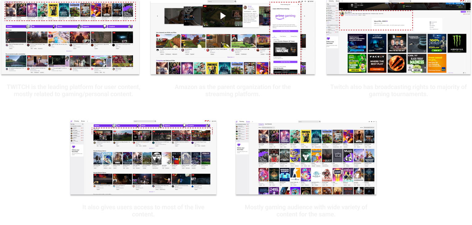
To provide better insights and additional information I decided to focus on each aspect of the analysis with respect to the twitch interface itself.
STRENGTHS
WEAKNESSES
OPPORTUNITIES
THREATS

UNDERSTANDING THE USER
User Persona
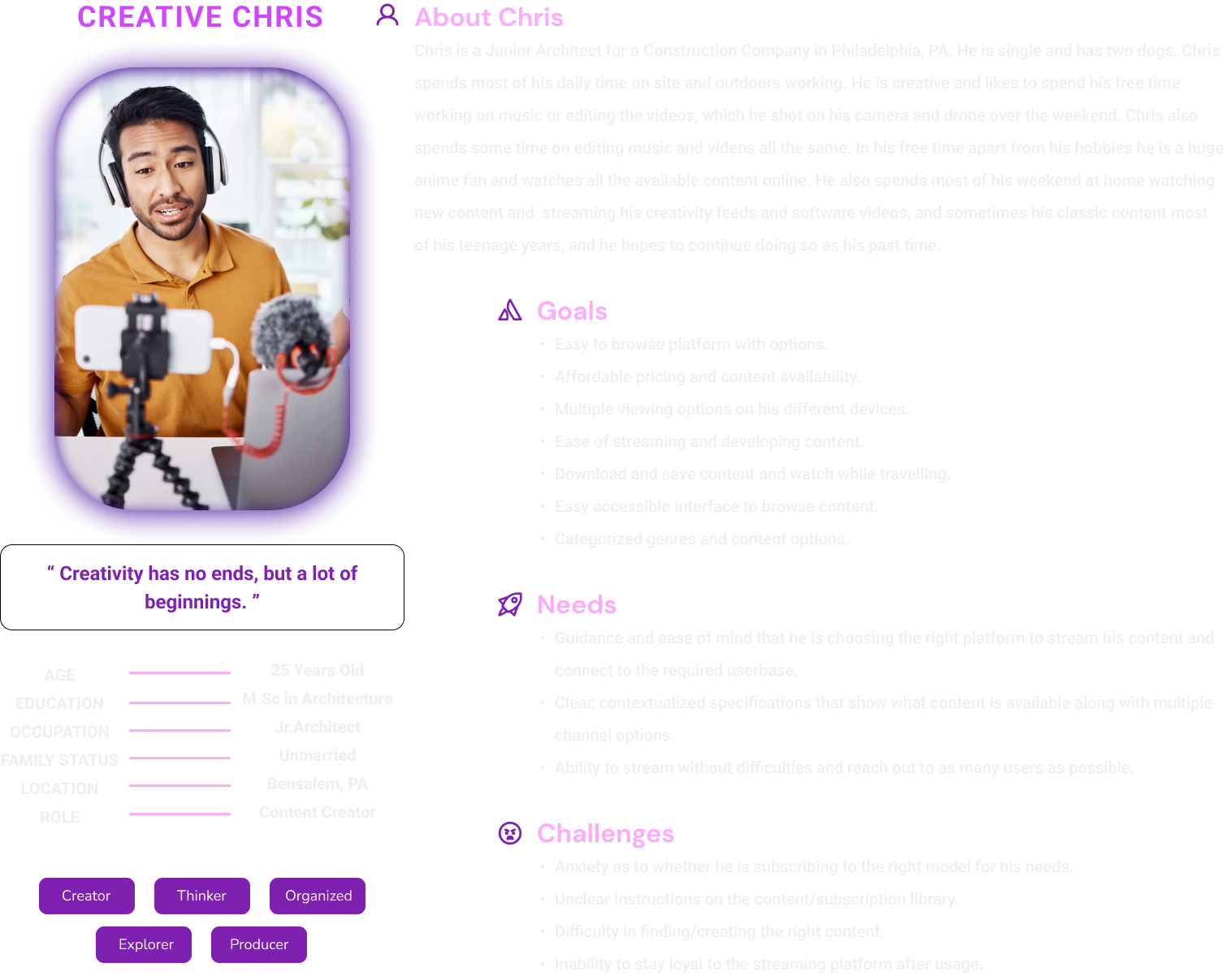
The initial research provided information on the different user categories. On services like Twitch, there were two main groups of consumers. The decision to develop two distinct personas stemmed from recognizing the diversity in our user base, specifically the primary user segments: the viewers and the streamers. It also provided me with a more profound understanding of our users' needs and behaviors, and shaped the direction of my UX and UI recommendations.

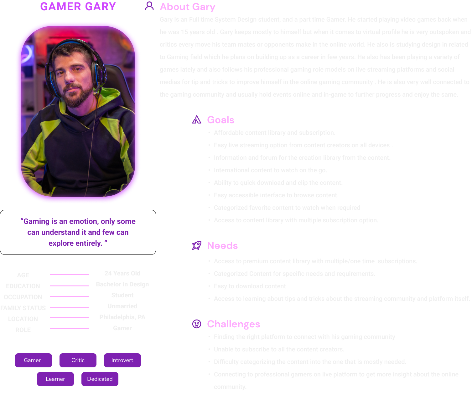

To provide better insights and additional information I decided to focus on each aspect of the analysis with respect to the twitch interface itself.
For the Streamer

For the Viewer

CONCEPT SKETCHES
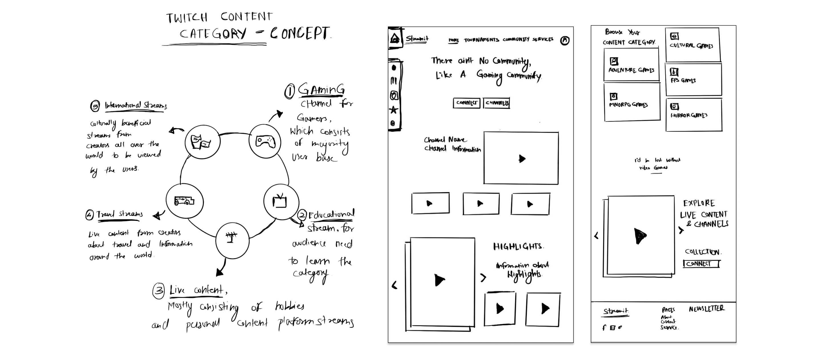
Initial concept sketches highlighted features that should be incorporated into Twitch's redesign. It was paramount to maintain the platform's core characteristics rather than overhauling it entirely, as Twitch's standing as the premier user-generated streaming platform is unmatched by any direct competitors. The primary aim was to enhance its user-friendliness, sticking to the original theme, but optimizing interfaces and interactions for improved usability.
FEATURE LIST
MoSCoW Method
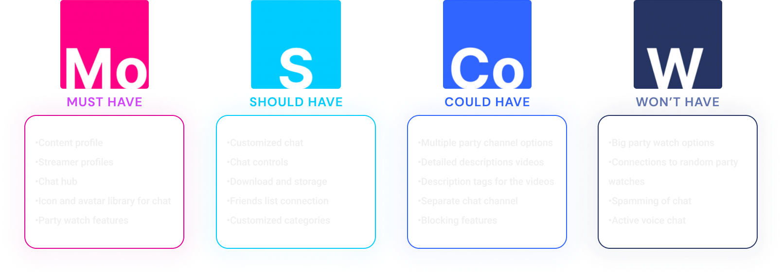
To establish the new features and changes that should be prioritized, I needed a strong and systematic methodology. The MoSCoW approach proved useful in this situation. I was able to divide the potential features into four groups using the MoSCoW method: Must-Have, Should-Have, Could-Have, and Won't-Have. This made it obvious what was absolutely necessary and what was only optional or nice.
SURFACE DESIGN
Site Flow
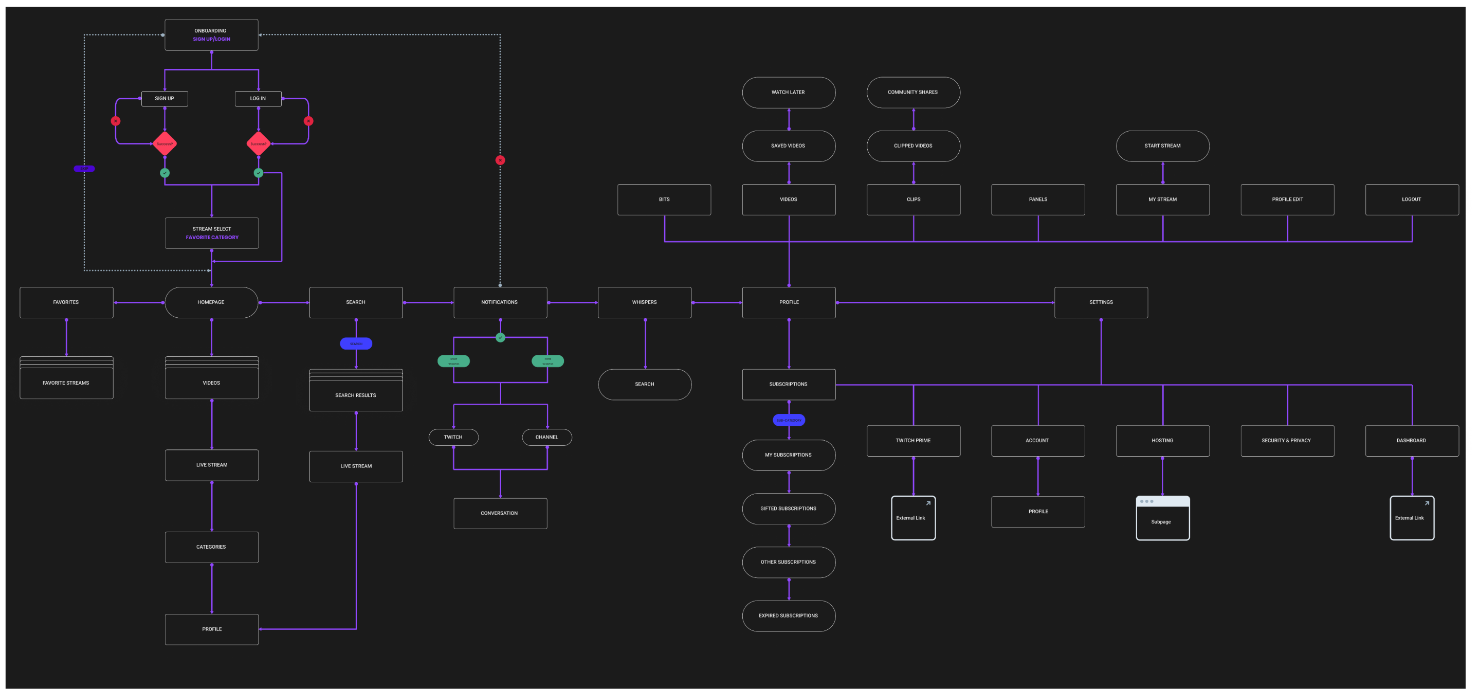
I created a site flow to provide a visual representation of the user's journey through the platform. This was crucial in understanding how different pages and features interconnected, and it allowed me to identify any potential barriers or pain points users might encounter. By doing this, I ensured the redesign resulted in a more intuitive and seamless experience, keeping users engaged and satisfied with their time on Twitch.
SKELETON DESIGN
WIREFRAMES - DESKTOP


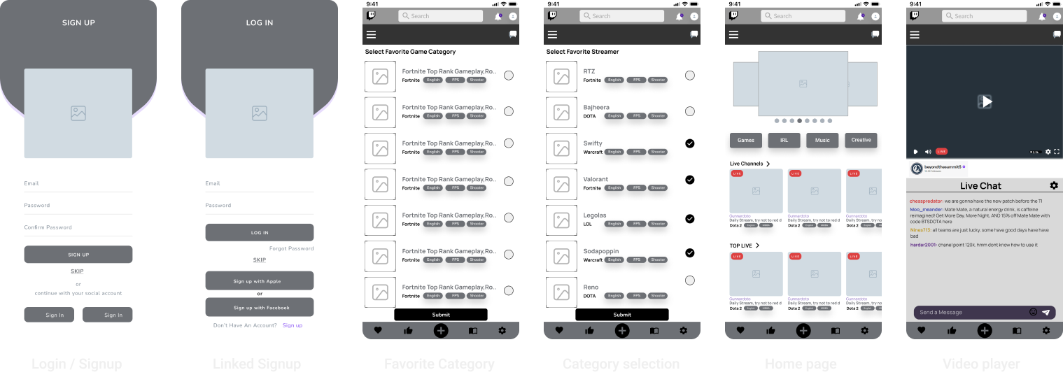
WIREFRAMES - MOBILE
MOODBOARD
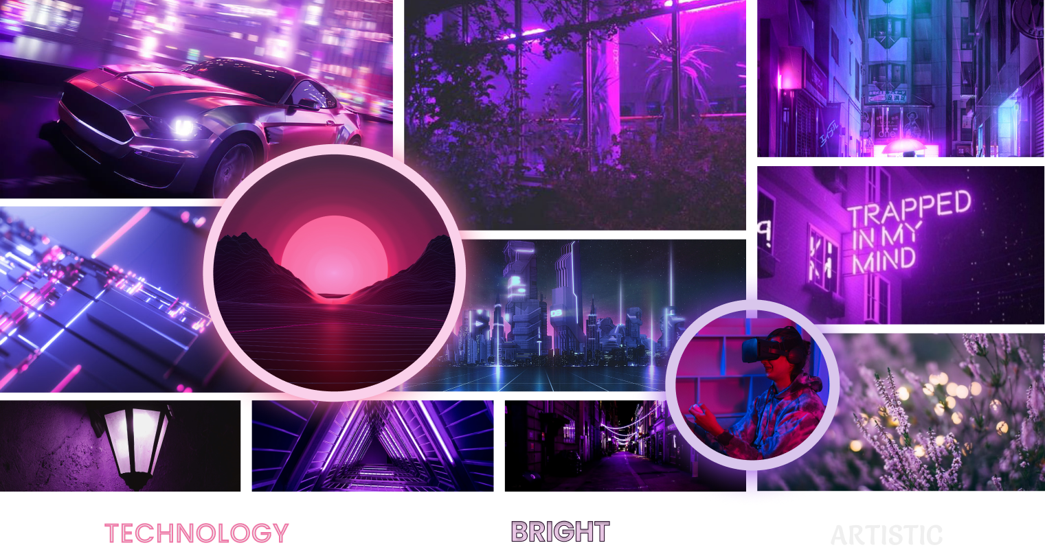
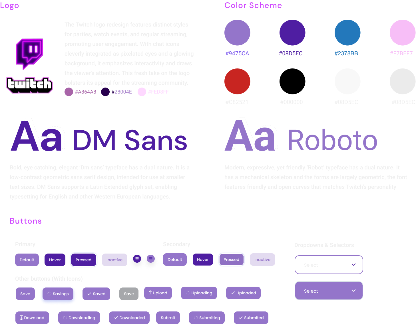
I created a mood board to visually communicate the look and feel I was aiming to achieve. This collection of colors, typography, imagery, and interface elements helped me align on the aesthetic direction for the project. Regarding colors, I leaned heavily into bright, high-contrast shades. Twitch's signature purple was a must, complemented with bright blues, pinks, and electric greens. These bold hues reflect Twitch's lively and dynamic community, and they resonate with the vibrant, energetic ambiance found in many streams.
DESIGN SCHEME
UI Kit
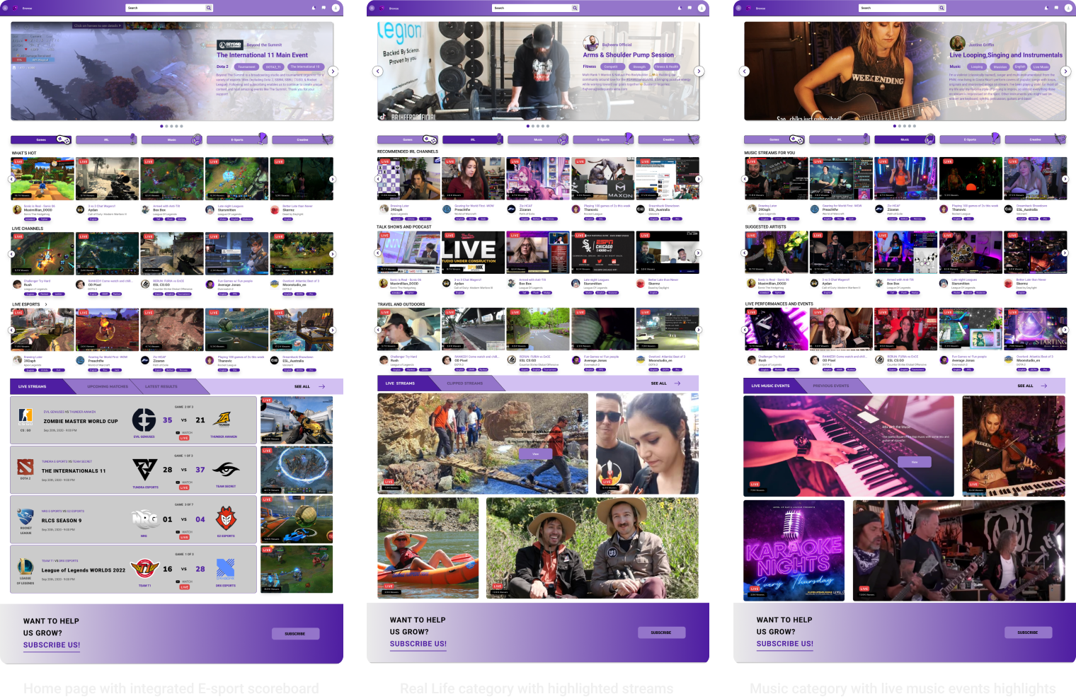
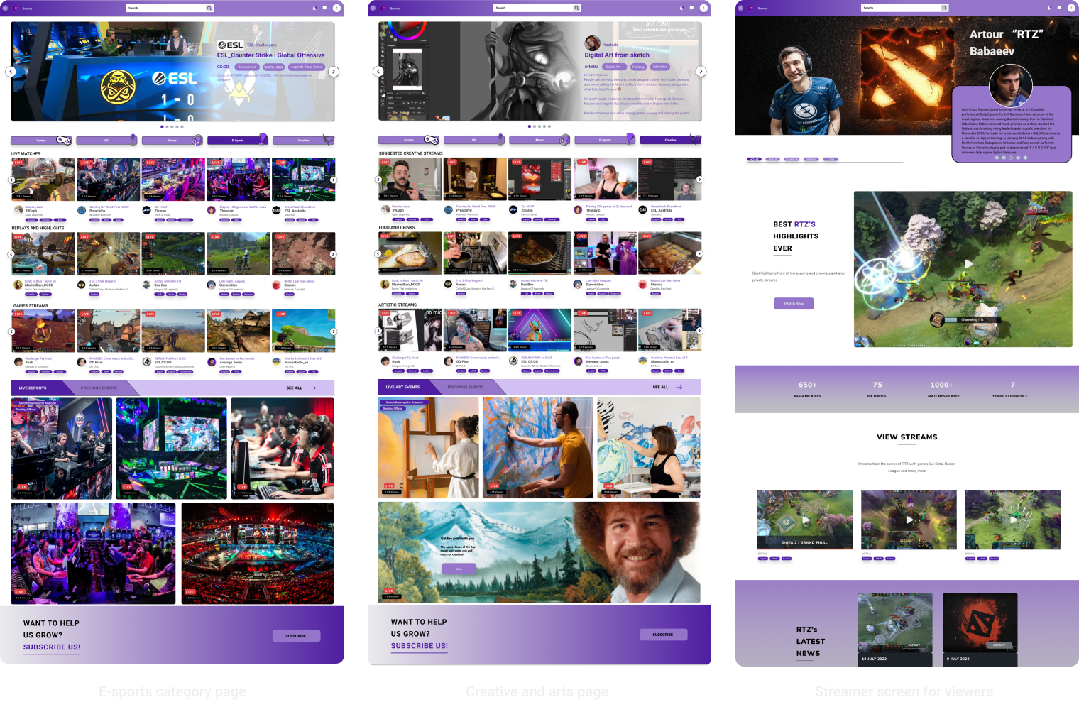
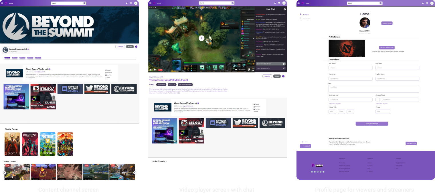
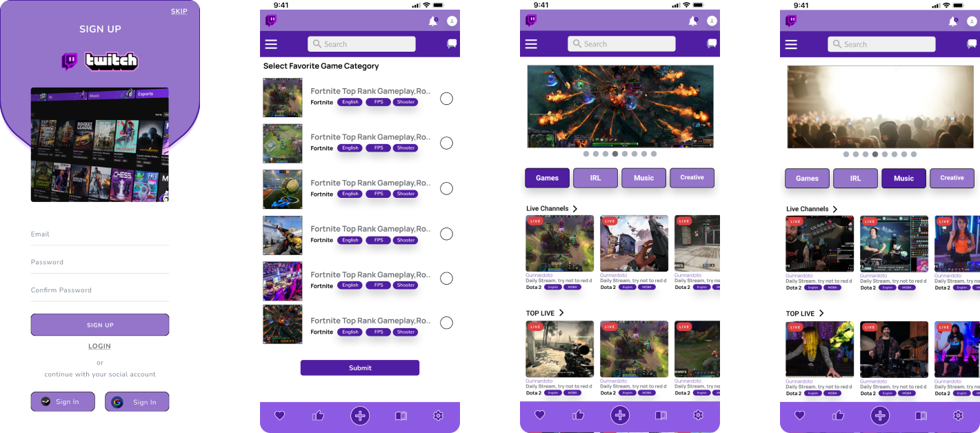
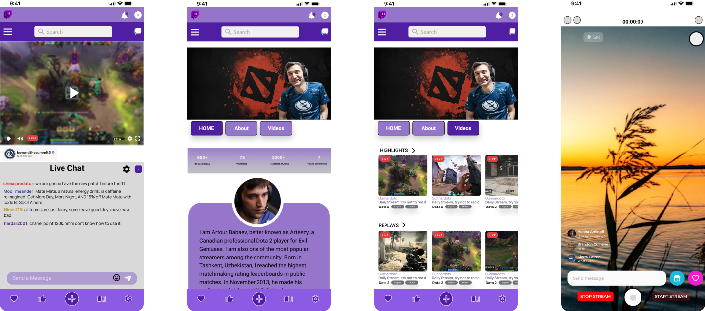
HIGH FIDELITY SCREENS & PROTOTYPE
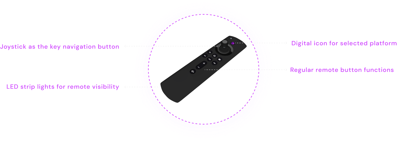
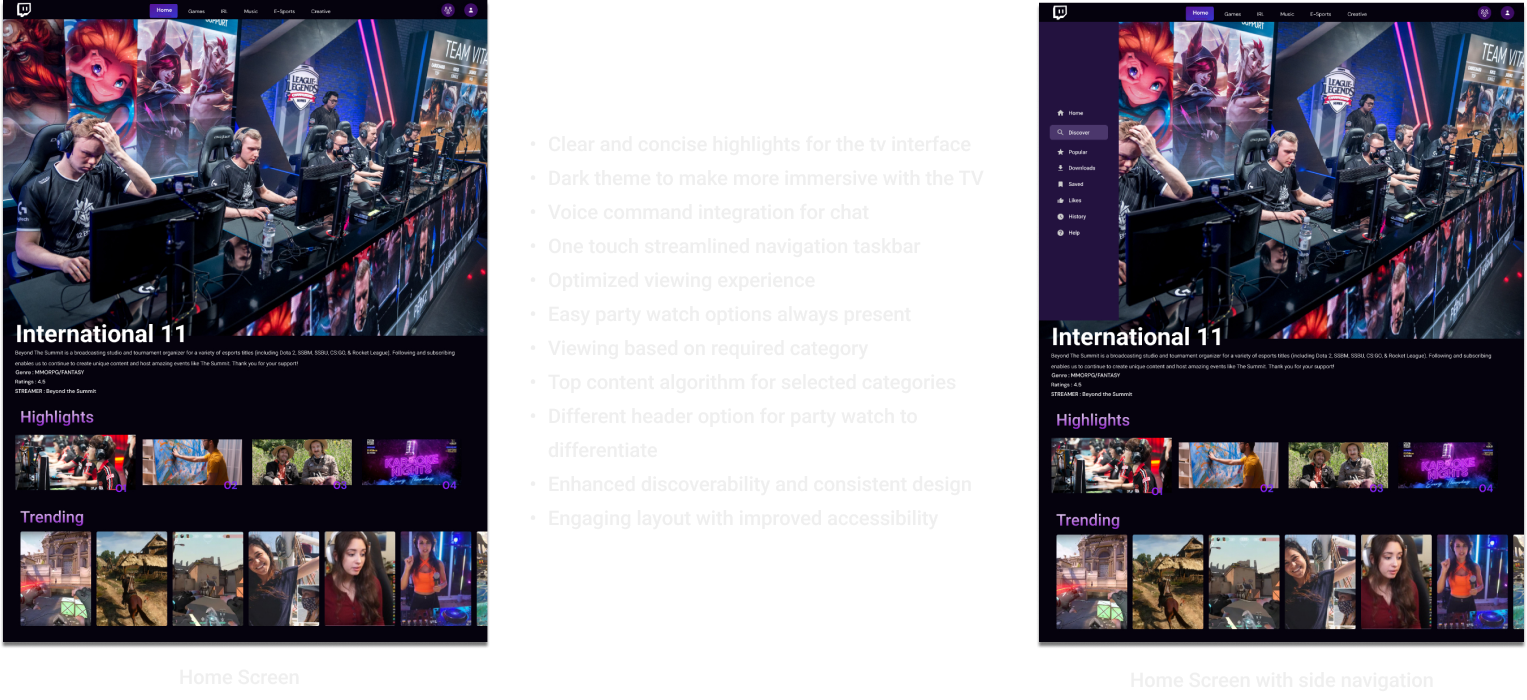
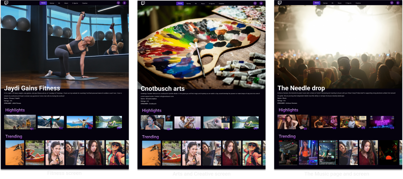
Television Interface
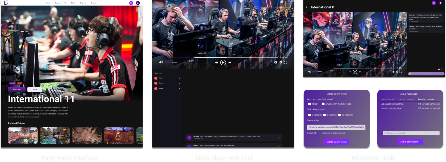
Website Interface
PLAY VIDEO
- Clean and uncluttered design interface
- Easy to read visuals
- Easy navigation for the streamer and the viewer
- Usage of the negative spacing from the current website
- Reduced information overload
- Highlights showing the main category page information
- User friendly navigation and personalized experience
- Easy to read visuals
- Enhanced interactivity with improved accessibility
- Consistent and responsive design
- Reduced information overload
- Visually appealing approach
- Efficient use of space
- Increased engagement
- Integrated social features and notifications
- Multitasking capabilities and search
USABILITY TESTING
Finally I conducted usability tests to determine the extent an interface facilitates a user’s ability to complete routine tasks. The tests were conducted with a group of potential users either, remotely, or on-site with portable equipment. Users were asked to complete a series of routine tasks. Sessions were recorded and analyzed to identify potential areas for improvement to the interfaces on the different platforms.
Recruitment
The participants were recruited through local contacts and one participant was a design classmate from the same course. The participants were informed using personal messages and formal emails to test logistics and requesting their availability and participation. Participants responded with an appropriate date and time.
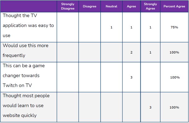
Each individual session lasted approximately 20 mins. During the session, the participants were informed about the test scenarios. Participants read the task scenarios and tried to find the information on the website. After each task, the participants were asked to rate the interface on a 5-point Scale with measures ranging from Strongly Disagree to Strongly Agree. Post-task scenario subjective measures included
Tasks/ Scenarios
Test participants attempted completion of the following tasks,
.Attempt Sign up or log in on the streaming platform
Try to stream or play a live content under specific category.
Try to find and edit personal profile page from the Homepage.
Try to find content creator profile page.
Results
All participants successfully completed Task 1. 2 participants successfully completed task - 2 whereas 1 had to go through some extra back and forth clicks same as task 3. All the participants had to look through multiple clicks to get to the Task 4 but were eventually able to get to complete it in the end.

Recommendation/ Feedbacks
The category page selection tabs and images can be reduced/ kept in the hover phase on the screen.
The Home page can be reduced with some graphic information
The categories on the home page can be more highlighted for quick selection.
The cluster of images can be moved a bit away from the landing page highlights.
The Hamburger menu can be bolder and more interactive with descriptions.
The Player profile page was a bit hard to find at first especially from the video or streaming menu.
The account profile is nice displayed but can be sub divided into two parts when it comes to personal info.
Majority of the participants found Twitch redesign wireframes to be well-organized, comprehensive, clean and uncluttered, very useful, and easy to use. Having a centralized site to find information is key to many if not all the participants.
CONCLUSION
The project of redesigning Twitch was rewarding and instructive, requiring extensive cross-platform design work. Applying diverse UX/UI approaches, from persona-based research to high-fidelity prototyping, gave me incredibly useful experience. The use of the MoSCoW technique for feature prioritizing and the significance of undertaking a SWOT analysis were among the key takeaways discovered. Understanding user needs and defining user personas and Jobs to be Done were essential for influencing design choices and creating a more engaging user experience.
The Twitch redesign project was a highly rewarding venture, offering significant insights into cross-platform design strategies, the application of market research in design, and aligning user needs with business goals. These learnings will undoubtedly be instrumental in my future design endeavors.
Let's Work Together
"Ready to transform your vision into captivating designs? Let's collaborate! With my design skills and our ideas, we can create something unique and impactful. Contact me and let's get started!"
Address
East Falls, Philadelphia, PA - 19144
Phone
(+1) 267-231-0774
vaibhavg0402@gmail.com

Vaibhav Gaikwad UX Portfolio
Ux | Ui Portfolio
